August 2026
Award winning branding design is what happens when strategy, creativity, and execution all come together — and the result speaks for itself.
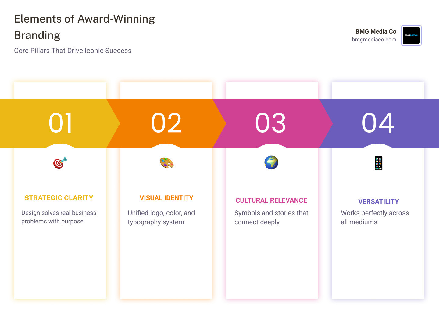
Here are the key elements that define it:
| Element | What It Means |
|---|---|
| Strategic clarity | The design solves a real business problem |
| Visual identity | Logo, color, and typography work as a unified system |
| Cultural relevance | Symbols and stories that connect with the audience |
| Versatility | Looks great on a screen, a uniform, or a billboard |
| Measurable impact | Drives real results like growth, recognition, or trust |
Great branding isn’t just pretty. It’s purposeful. The best examples — from national space agencies to energy giants to independent coffee shops — all share one thing: every visual decision means something.
And the stakes are real. A well-executed rebrand helped City Colleges of Chicago grow enrollment by +6.9% year-over-year, outpacing both state and national averages. That’s the power of brand design done right.
I’m Blake George, founder of BMG Media Co, and over 15+ years of building brands for companies ranging from startups to multi-billion-dollar enterprises, I’ve seen what separates award winning branding design from work that just fills a style guide. Let’s dig into the projects and principles worth stealing from.
Quick look at award winning branding design:
When we talk about award winning branding design, we aren’t just talking about a popularity contest on social media. We are talking about rigorous evaluation by international panels of experts who live and breathe visual communication. By April 2026, the landscape of design awards has become more competitive than ever, with tens of thousands of entries vying for a handful of top honors.
For instance, Behance now hosts over 10,000 projects tagged as “award-winning,” showcasing everything from boutique Italian restaurant identities to global tech rebrands. But a few specific organizations stand out as the “Oscars” of the design world.
The 45 Award-Winning Branding Projects to Inspire Your Work curated by the Creative Communication Awards (C2A) is a prime example of the diversity in modern excellence. These projects prove that whether you are a massive corporation or a small local business, high-level branding design services are the differentiator in a crowded market.
The Red Dot Award is perhaps the most recognized seal of quality in the world. Since 1993, it has honored achievements across 18 categories. What makes Red Dot unique is its tiered system of distinctions:
A standout from recent years is the German Brand Award: E.ON – Revamping an Iconic Brand. This project was a masterclass in repositioning an energy giant. By centering the iconic logo and stripping away unnecessary elements, the brand shifted its perception from “old energy” to a leader in the sustainable transition.
The Indigo Design Award has seen such a massive surge in interest that it introduced a dedicated branding category with 37 subcategories. This reflects a major trend in 2026: branding is no longer a “one size fits all” service. There are now specific standards for branding in banking, education, hospitality, and even social activism.
Winning an Indigo award often requires breaking industry clichés. It’s about taking a biosciences company and making it feel human, or taking a traditional horse racing brand and making it digital-first. For agencies and clients alike, being named a top branding company through these awards is a signal to the market that you aren’t just following trends—you’re setting them.

Looking at specific case studies helps us understand the “why” behind the “wow.” When we analyze award winning branding design, we see a common thread of balancing deep-rooted history with forward-thinking aesthetics.
Whether it’s a government agency or a global marketing firm, the goal of these professional branding services in Michigan and beyond is to create an identity that feels inevitable—like it was always meant to look this way.
The Marketing Awards 2024 Winner for the Canadian Space Agency (CSA) is a brilliant example of symbolic storytelling. The CSA needed to modernize its image to assert its role in the global space industry.
The design team utilized a vertical orientation to symbolize flight and elevation. By merging the iconic Canadian maple leaf with a star motif, the logo became a source of national pride. A trio of stars forms a stable triangle, representing the rigorous expertise required for space exploration. This rebrand wasn’t just a logo change; it was a strategic move to democratize space activities and make the agency’s work more visible on equipment like the Canadarm3. You can see the full execution at the Agence Spatiale Canadienne winner’s page.
In 1926, Marcel Bleustein-Blanchet carved a few bold strokes into a door in France, marking the birth of Publicis. Fast forward to the Publicis Nouveau | 2025 Awards Winner, and we see how that history can be reimagined.
The “Nouveau” identity uses a radical new typography system that connects those 1926 origins to the present day. It proves that you don’t have to throw away your history to be modern. By taking the original brand marks and evolving them into a cohesive visual language, the agency demonstrated that they could lead change rather than merely react to it.
The world of award winning branding design in 2026 is defined by “deliberate imperfection” and “strategic minimalism.” We are seeing a move away from overly polished, generic corporate looks toward identities that have “friction” and personality.
One of the most exciting shifts is the “Zero Design” philosophy. This approach, championed by designers like Marko Stanojevic, focuses on the absolute essentials to create visual tension and balance.
The What Next Brand Identity by Marko Stanojevic is a Silver A’ Design Award winner that perfectly encapsulates this. The logo transforms a simple symbol into a question mark by placing a smaller square at a tipping point. This creates a sense of tension—it’s both a question and an answer at the same time.
Similarly, the Black Beans Branding by Deborah Avila shows how a merger of two agencies can be handled with elegance. The brand needed to reflect a premium position in the digital market immediately. By combining graphic design with custom illustration, the identity achieved quick approval from directors and was ready for use across all digital platforms instantly. This type of agility is a hallmark of the best branding agencies for small businesses.
Storytelling is the “secret sauce” of branding. It’s not just about the colors; it’s about why those colors were chosen. For example, the use of “China Red” in a children’s clothing brand to symbolize good fortune, or a brand identity for a seafood restaurant that avoids the cliché of a fish logo to convey a higher level of sophistication.
Award-winning work often draws from:
This level of depth is what separates a generic name from a brand that sticks. If you’re looking for the logic behind these decisions, checking out reports on top brand naming agencies can reveal how much linguistics and psychology go into a winning identity.
At the end of the day, we don’t just design for awards; we design for results. Award winning branding design has a measurable ROI that goes far beyond aesthetics. It changes how people perceive a company, how much they are willing to pay, and how likely they are to remain loyal.
When a brand is cohesive, it builds subconscious trust. This is why top product packaging agencies focus so heavily on the “unboxing” experience—it’s the first physical touchpoint a customer has with the brand’s promise.
Consider the rebranding of the City Colleges of Chicago. This wasn’t just a facelift; it was a strategic overhaul to clarify the value of community college. The result? A 6.9% increase in enrollment. In a sector where numbers are often declining, that is a massive win driven by clear communication and a strong visual identity.
We also see this in the event space. The Global Gaming Expo attracts over 20,000 attendees. A rebrand in that space has to work across massive environmental graphics, digital apps, and tiny badges. When the branding is award-worthy, it makes the entire event feel more prestigious, which in turn attracts higher-tier exhibitors and sponsors. This is why being recognized among the best branding agencies in Detroit matters—it’s proof that the work works.
It’s a combination of three things: strategy, innovation, and execution. An award-winning project doesn’t just look good; it solves a specific problem in a way that hasn’t been seen before. According to experts at Design Womb, the best work often involves a deep dive into the client’s “why” before a single pixel is moved.
Awards act as a third-party validation of quality. For a consumer, seeing a “Red Dot” or “Indigo” winner badge builds immediate trust. For the business, it provides a competitive advantage that can be used in marketing to justify premium pricing and attract top-tier talent.
Absolutely. In fact, the World Brand Design Society (WBDS) has specific rankings for micro-teams and individual creatives. Small teams are often more agile and can take bigger creative risks than large, “safe” corporate agencies. This creative agility is often what the judges are looking for.
At BMG Media Co, we believe that every brand has a story worth telling—and an award worth winning. Based in Birmingham, Michigan, we’ve spent years perfecting the art of the custom rebrand. We don’t use templates, and we don’t do “generic.”
With over 1,000 sites and hundreds of brand identities completed, we know that award winning branding design is about more than just a pretty logo. It’s about building a high-performance visual system that drives your business forward. Whether you need a complete identity overhaul or a custom web app that reflects your new brand, we’re here to take your business to the next level.
Ready to make your competitors jealous? Let’s build something iconic. Explore our Award Winning Branding Design Services
