May 2026

A SaaS website redesign is the process of strategically rebuilding or overhauling your software company’s website to improve conversions, messaging clarity, user experience, and search visibility — with the goal of turning more visitors into qualified leads and paying customers.
Here’s a quick overview of what a SaaS website redesign typically involves:
Here’s the uncomfortable truth: most SaaS websites look polished and convert poorly.
Teams spend months on colors, fonts, and hero animations — then wonder why demo requests aren’t moving. The problem is rarely the aesthetics. It’s the messaging, the structure, and the friction baked into every step of the buyer journey.
Consider this: 94% of first impressions are based on web design. And with global SaaS spending estimated at $176.6 billion, the competition for buyer attention has never been more intense. Your website isn’t just a digital brochure — it’s your best salesperson, working around the clock.
When a prospect lands on your site, they’re usually comparing you against four or five other tools in separate browser tabs. If your value proposition isn’t clear within five seconds, they’re gone.
That’s exactly why a well-executed redesign — one built around your buyer’s journey, not your internal product roadmap — can be the single highest-leverage investment you make this year.
I’m Blake George, founder of BMG MEDIA Co., and over the past decade I’ve led SaaS website redesign projects for companies ranging from early-stage startups to enterprise platforms, helping them turn underperforming sites into conversion-focused growth engines. In this guide, I’ll walk you through everything you need to know — from spotting the warning signs that a redesign is overdue, to launching without losing your search rankings.
A redesign makes sense when your website no longer reflects your product, your buyers, or your growth goals. In SaaS, that happens fast. Products evolve, pricing changes, new use cases appear, and yesterday’s “good enough” website quietly turns into a conversion leak.
The most common reasons to redesign are:
If several of these sound familiar, your site is probably asking for help:
A lot of B2B SaaS teams wait too long because the site is still technically “working.” But if sales avoids sharing it, marketing can’t launch pages quickly, and prospects leave confused, it is not really working.
Not every project needs the same level of change.
A refresh is fine when the bones are good. A redesign is better when the message and journey are broken. A rebuild is usually necessary when the current tech stack limits performance, flexibility, SEO, or maintainability.
The trick is aligning stakeholders around the real problem before design begins. Otherwise, teams ask for a “modern look” and accidentally avoid the much less glamorous issue: conversion friction.
The market is crowded, buyer expectations are higher, and design quality now shapes credibility almost instantly. Since 94% of first impressions are based on web design, your site influences trust before a prospect reads a sentence.
And because SaaS spending is massive, competition is not slowing down. In a category with $176.6 billion in global spend, the companies that win often communicate value faster, guide users better, and reduce doubt sooner.
For Michigan SaaS brands and national B2B software teams alike, a redesign is often less about “looking better” and more about protecting revenue.
A smart saas website redesign should improve three things together:
When these are handled separately, the site becomes disjointed. When they’re planned together, the site becomes much more effective.
Good UX means the site feels easy to understand and easy to use. For SaaS, that usually starts with clarity.
A redesign can improve UX by:
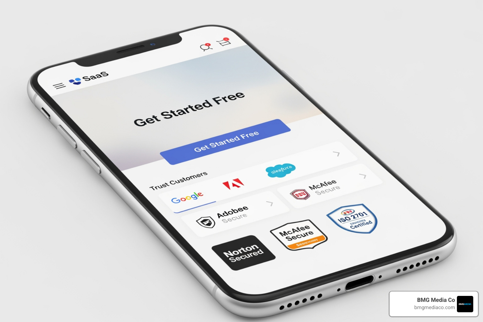
Mobile matters more than many SaaS teams assume. Research consistently shows mobile traffic is a huge share of web visits, and in some SaaS funnels, a majority of early sessions start there. If your mobile experience feels like a cramped afterthought, conversions will suffer.
Conversion gains often come from small clarity improvements, not giant visual overhauls.
What tends to help most:
We’ve seen the same pattern over and over: when a homepage swaps vague jargon for a direct outcome, demo clicks improve. When social proof moves closer to the CTA, more users act. When mobile gets a sticky CTA, trial starts often rise.
For a deeper look at conversion-focused structure, see these web design principles.
A redesign can absolutely improve SEO, but only if handled carefully. Done badly, it can tank rankings. Done well, it can strengthen them.
Key SEO tasks during redesign include:
Performance matters too. Faster pages improve UX and support search performance, especially when Core Web Vitals are part of the plan from day one. If you want to go deeper, read our guide to Core Web Vitals optimization.
Certain elements show up again and again on strong SaaS sites because they work.
Your hero section has one job: make the product understandable fast.
That means:
A visitor should quickly understand:
If your headline needs a translator, it is probably not doing its job.
Every meaningful page should guide the next step.
Best practices include:
For example, enterprise buyers may want “Book a Demo,” while product-led buyers may prefer “Start Free.” Strong sites support both without making either path confusing.
SaaS buyers want to see the product. Real screenshots usually outperform decorative abstractions because they help visitors evaluate fit faster.
Useful trust-building elements include:

Avoid generic stock imagery on key pages. It fills space, but it rarely answers buyer questions.
Pricing pages do heavy lifting in SaaS. Even when enterprise deals require sales conversations, buyers still want transparency.
Include:
| Pricing page element | Buyer intent it supports |
|---|---|
| Plan tiers | Quick self-selection |
| Feature table | Compare options confidently |
| Starting price or range | Budget qualification |
| FAQ section | Objection handling |
| Enterprise CTA | High-intent sales path |
A redesign is not just page design. It is also a content strategy project.
The best SaaS sites support conversion and discovery with:
One smart move is featuring your best-performing educational content, not simply your latest blog post. If you want a stronger framework for this, see how the highest-converting websites actually work.
Traditional redesigns often start with internal opinions. Authority Architecture starts with the buyer journey.
Common mistakes include:
That is how teams end up with a pretty new site and the exact same old problem.
This approach maps your website to the stages buyers move through:
Then it aligns page types, messaging depth, proof, and CTAs to each stage.
For example:
It also supports ICP segmentation. If different audiences buy for different reasons, the architecture should reflect that instead of forcing everyone through the same generic story.
B2B SaaS buying is rarely a one-page decision. There are stakeholders, objections, budgets, comparisons, and internal politics. A journey-based architecture helps by:
In short, it treats the website like a revenue tool, not an online brochure.
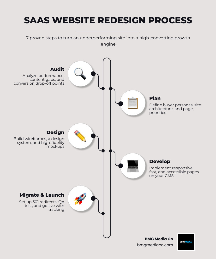
A successful saas website redesign follows a disciplined process.
Before changing anything, we need a baseline.
Audit inputs should include:
This stage shows where users drop off, what content already performs, and where the biggest gaps are.
Planning is where redesigns either become strategic or become chaos with mood boards.
Key planning tasks:
Our website redesign checklist is a useful companion here.
Now the work becomes visible.
Best practices:
For more on responsive execution, see how to make your website look good on every screen.
Launch day should feel controlled, not like a caffeine-powered hostage situation.
A clean launch includes:
Our guide to high-performance website launches covers this in more detail.
Launch is the start of the next phase, not the finish line.
Track:
Then optimize. Run A/B tests, adjust headlines, refine CTAs, improve page speed, and expand content where you see demand. Ongoing measurement is how redesign ROI becomes real. We cover this in performance monitoring.
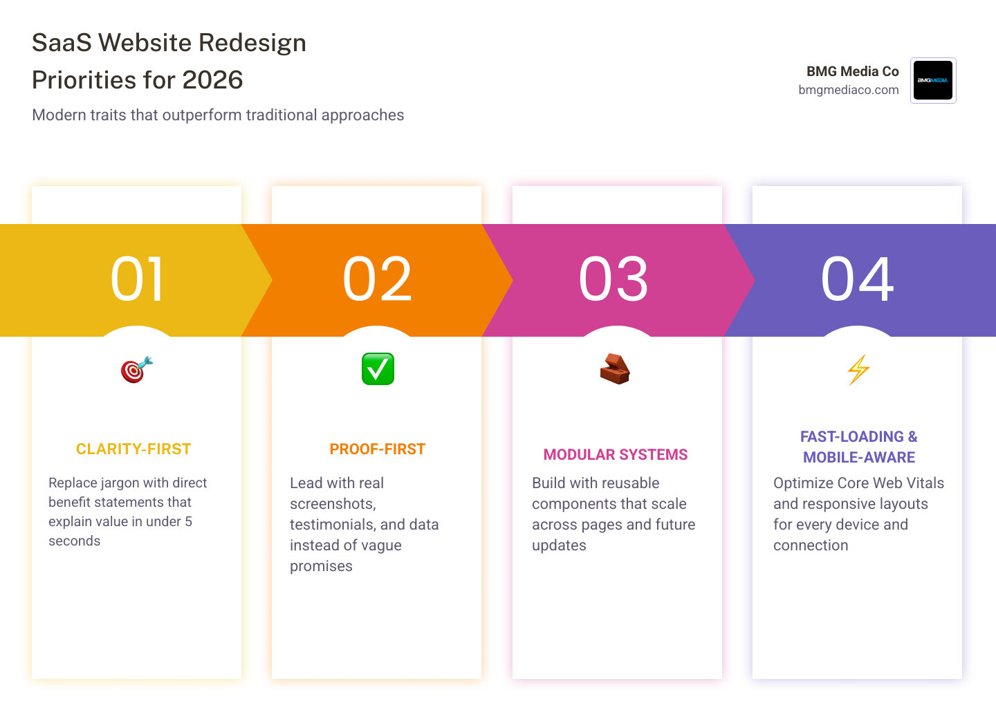
By May 2026, the best SaaS websites share a few clear traits.
They are:
Before redesigning, study patterns, not just pretty visuals. Look at hero structures, pricing layouts, navigation models, product tours, and proof sections.
Good starting points include broad design galleries, UX pattern libraries, and curated examples from non-competing industry publications. The goal is to study messaging clarity, CTA structure, page hierarchy, and product storytelling rather than copy another brand’s visual style.
For teams that want regional context, it can also help to review how SaaS companies in your market position themselves more generally without treating any single website as the blueprint. It is also worth reviewing foundational UX concepts like information architecture, since a strong SaaS website redesign depends as much on content structure and user flow as visual design.
The best redesigns do not just solve today’s homepage problem. They make future growth easier.
That means:
A flexible system helps marketing launch faster without breaking consistency. Our advice on regular website updates is relevant here.
A full redesign is commonly needed every 2 to 3 years, but that is not a hard rule. If your product, positioning, buyer journey, or CMS has changed significantly, you may need it sooner. Between redesigns, continuous iteration is ideal.
It depends on scope.
The timeline depends on page count, content complexity, stakeholder alignment, integrations, and migration requirements.
A successful redesign improves business outcomes, not just aesthetics.
Look for:
If the site looks nicer but pipeline does not improve, that is decoration, not transformation.
A great SaaS website redesign should do more than modernize the visuals. It should clarify your value, reduce friction, strengthen SEO, support your sales process, and give your team a scalable foundation for growth.
At BMG Media Co, we build fully custom websites and digital experiences designed for performance, flexibility, and conversion. If your current SaaS site is underperforming, hard to manage, or simply no longer reflects the quality of your product, it may be time for a smarter rebuild.
To see how we approach custom strategy, UX, design, and development, explore our custom web design and development services.
